TL;DR
A nice colour, legible in larger nib sizes or wet writing pens, but the shimmer is almost impossible to see in writing. It’s a good light blue if that’s what you’re into. It’s also a very expensive ink at over £1 per ml.
General Description
Ferris Wheel Press Blue Beryl Tonic is a light blue ink that shades to purple and has a rose gold shimmer. It’s available as part of FWP’s FerriTales line in 20ml bottle, but I’m using a sample.
In Writing
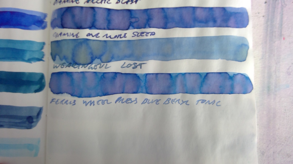
Tomoe River (Sanzen):

So as you can see, I didn’t clean out my stub properly and as such those lines are slightly darker and more purple. TR isn’t cheap, so I decided to just go with it regardless.
I love the shading visible in the swatch. I’m also loving how it looks in my medium nib.
Endless Regalia:
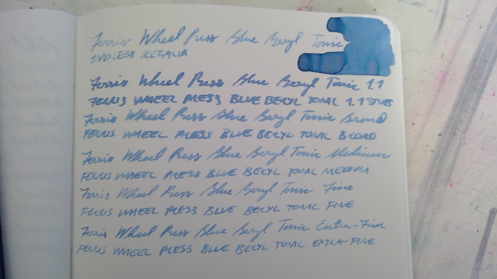

This is the paper I had the most pleasant experience with. I found the ink to be a little bit dry but Regalia just feels so nice to write on. Inks seem to spread out a little on it. Not in a feathery way, just in the sense that you get a slightly thicker line than you do on other papers. The stub came out gloriously on this paper.
Rhodia:

As usual, Rhodia doesn’t show ink qualities very well, but the ink does perform nicely on it. It’s harder to see the finer sizes, though, so I’d recommend against them.

Water-resistance is terrible. Don’t get this one wet. Anything the water touched is gone.
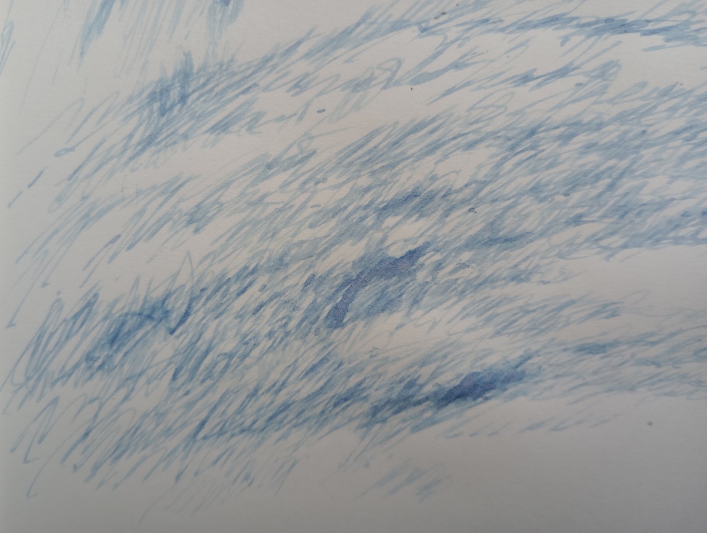
In Art


Pretty blue, purple, and pink chromatography. I’m still trying to figure out how to incorporate chromatography into my art without creating the kind of monstrosity I have on the left. I think I did a much better job on the right. It’s a very soft looking ink. As you can see, the shimmer is still barely visible, despite being applied heavily in some areas. Probably best just to forget it’s there and just love it for the colour.

Leave a comment